Over the last year or so, I have changed from using base R graphics for all my plots to using ggplot2 for almost everything.
I want to show you why.
I’m going to use the iris dataset with is available within R.
head(iris)
##   Sepal.Length Sepal.Width Petal.Length Petal.Width Species
## 1          5.1         3.5          1.4         0.2  setosa
## 2          4.9         3.0          1.4         0.2  setosa
## 3          4.7         3.2          1.3         0.2  setosa
## 4          4.6         3.1          1.5         0.2  setosa
## 5          5.0         3.6          1.4         0.2  setosa
## 6          5.4         3.9          1.7         0.4  setosa
I want to start by plotting a histogram of Sepal.Length.
With base R this is easy.
hist(iris$Sepal.Length)
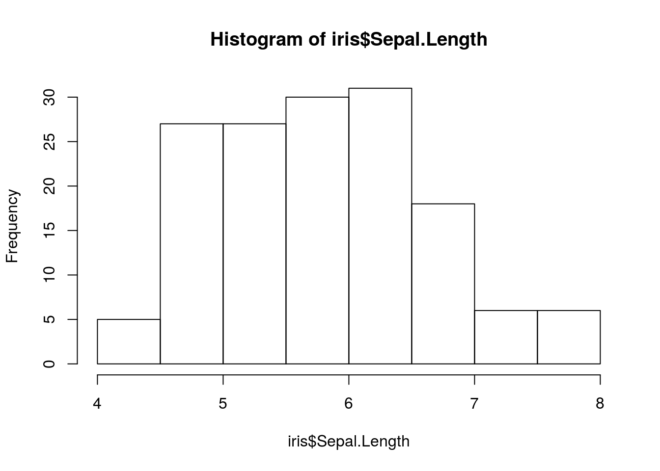
That was easy, and with a little extra work, I could give the plot better axis labels and so on.
The ggplot2 code is a little longer.
library("ggplot2") # load ggplot2 package
ggplot(iris, aes(x = Sepal.Length)) +
  geom_histogram()
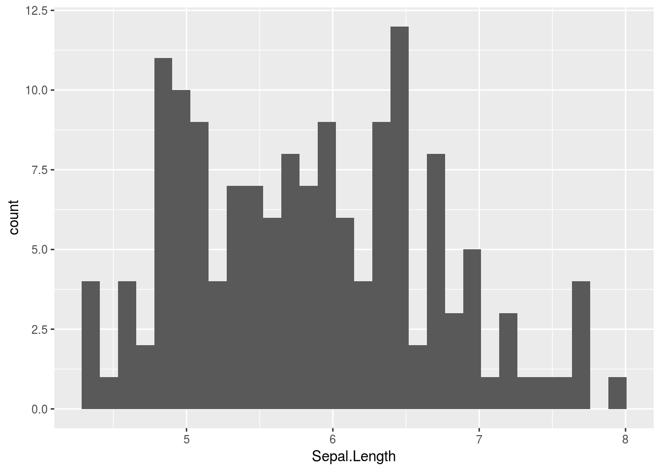
This histogram looks a little different from the base R version because it is using many more bins. Probably too many. This could be controlled by using the bins argument to geom_histogram.
In the iris data.frame, there are three species. I want to have separate histograms for each. Of course this is possible with base R.
par(mfrow = c(1, 3))
xlim <- range(iris$Sepal.Length)#use to ensure plots span same x
by(iris, iris$Species, function(x){
  hist(x$Sepal.Length, main = x$Species[1],
       xlab = "Sepal length", xlim = xlim)
})
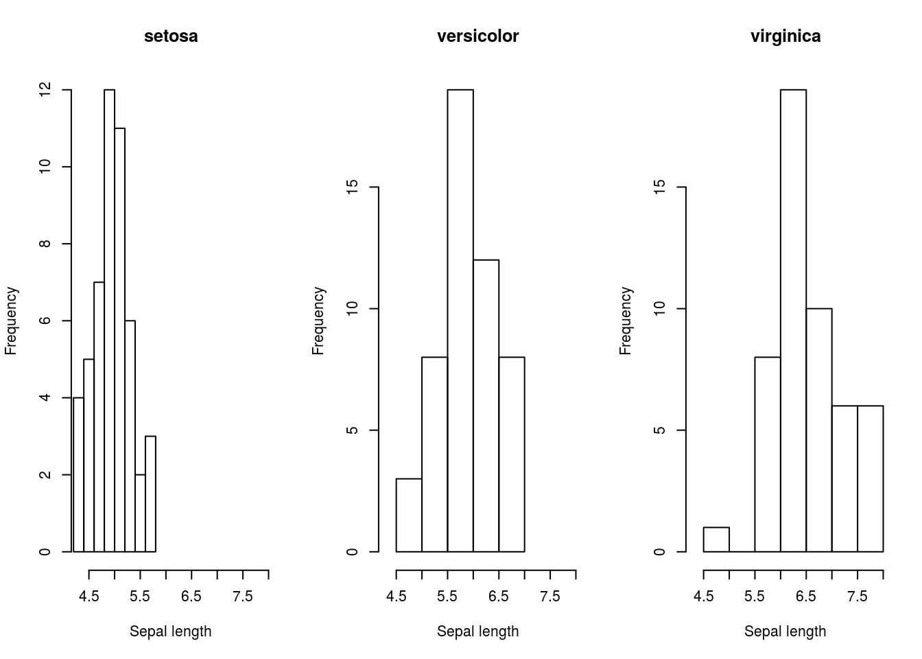
But it is not trivial – this code loops over the species and plots a histogram of each. Looks like I forgot to specify the number of bins for the histograms to use so they would all be the same width, and I might also want to standardise the y-axis scale.
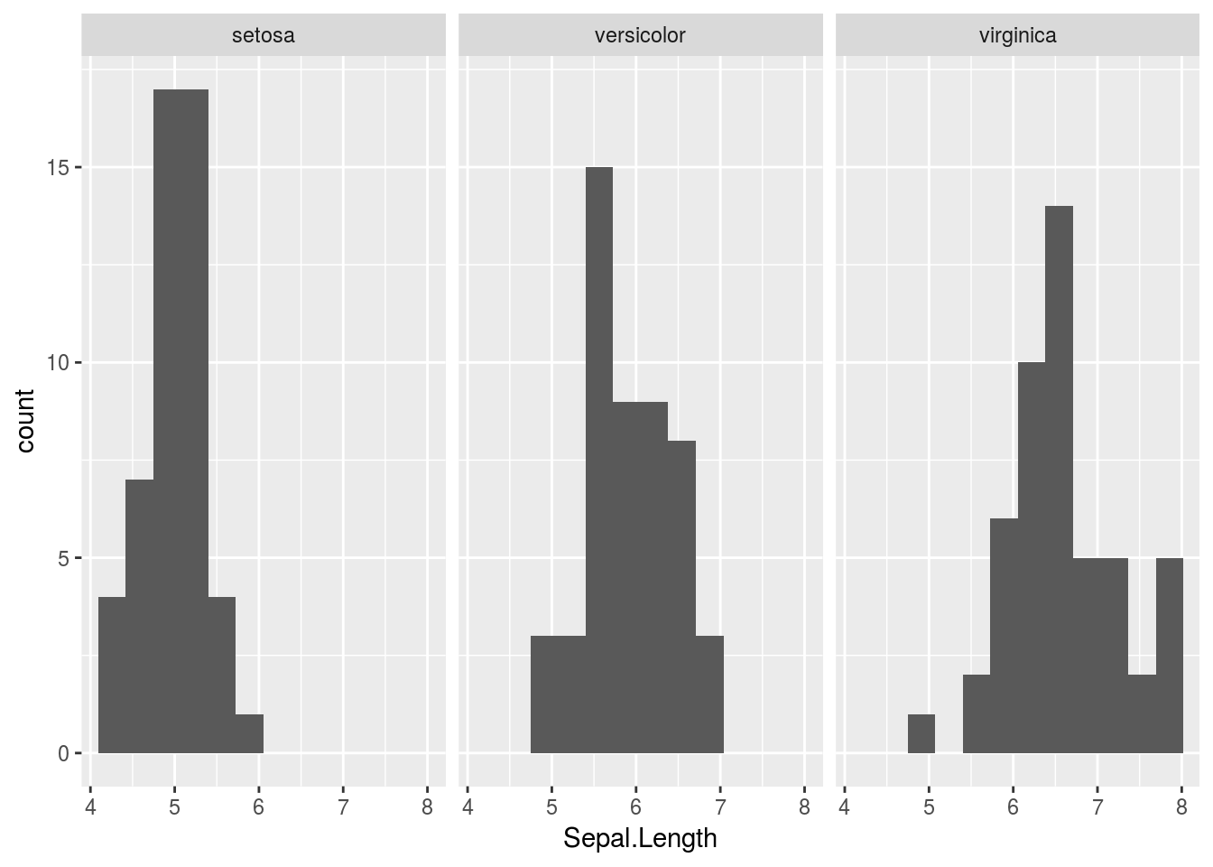
To make the equivalent plot in ggplot2 is much simpler. We just need to add a facet to the code.
ggplot(iris, aes(x = Sepal.Length)) +
  geom_histogram(bins = 12) +
  facet_wrap(~ Species)
But I’ve changed my mind about how to present these data. I now want a single histogram, with the different species shown by different colour fills.
This too is possible in base R, but it will take a lot of effort (or cunning) to get it to work. In ggplot2, I simply need to add fill = Species to the aesthetics.
ggplot(iris, aes(x = Sepal.Length, fill = Species)) +
  geom_histogram(bins = 12)
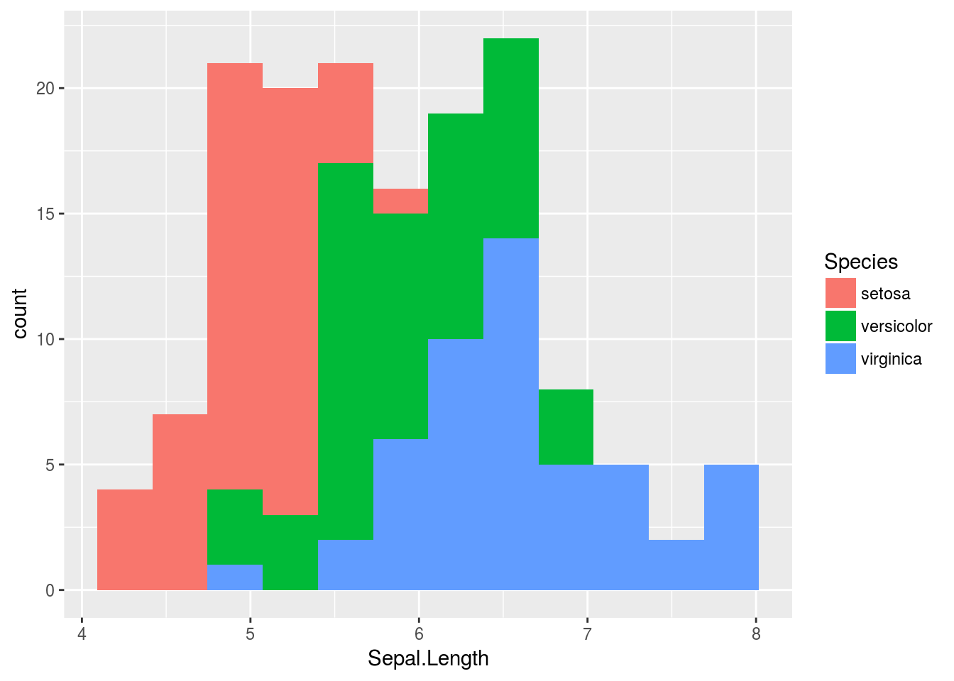
ggplot even adds a legend by default.
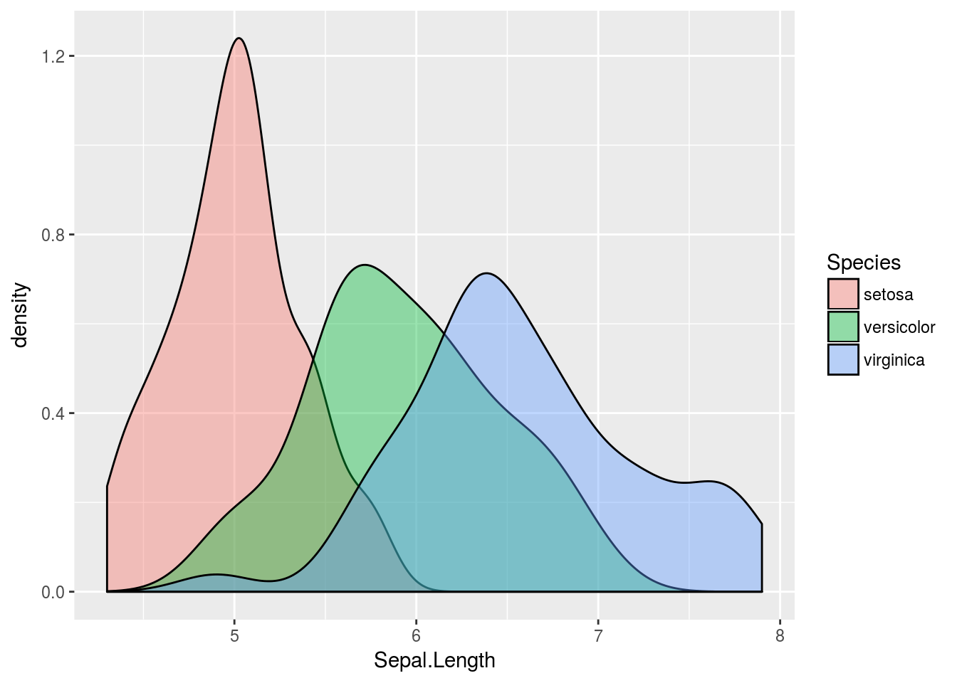
Perhaps a density plot would look better – with ggplot2 it is easy to try, just change the geom to geom_density.
ggplot(iris, aes(x = Sepal.Length, fill = Species)) +
  geom_density(alpha = 0.4) # alpha gives transparency
There are several other geometries that could be used to display these data. With ggplot it is easy to try just be changing the geom, with base R, we would probably have to completely rewrite the code.
jt <- ggplot(iris, aes(x = Species, y = Sepal.Length, colour = Species)) +
  geom_jitter(height = 0, width = 0.3) #height and width specify the amount of jitter
bx <- ggplot(iris, aes(x = Species, y = Sepal.Length, fill = Species)) +
  geom_boxplot(notch = TRUE) #notch gives uncertainty of the median
vi <- ggplot(iris, aes(x = Species, y = Sepal.Length, fill = Species)) +
  geom_violin() #density plots on their side
gridExtra::grid.arrange(jt, bx, vi)
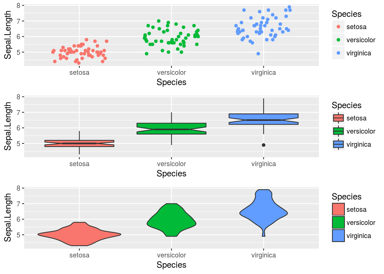
This ease of changing the geometries (or aesthetics) used in a plot, with consistent code, is one of main advantages of ggplot2.