ggplot2 is a very powerful plotting package available in R, but sometimes you just want more: maybe you want to want to make your plots more accessible to colour-blind audiences. Or maybe you just don’t like the included themes. Or maybe you just want more colour in your life like some of the students coming to the R-club and wondering how you can make pink plots.
Before we start, a good tip is to look at the syntax for the built-in themes such as theme_bw, theme_classic or just our good friend theme_grey (just type the name into the R console and press return). Another good tip is to use the help files, they can tell you more about all the possibilities of each theme option – see ?theme.
Some other things that are important to know to understand this guide:
- All the highlighted lines in this guide is actually read as one command into R. Still I would recommend you to copy this code into your editor of choice.
- You can use names of colours (see
color()) rather than the hex codes (for example “#e600e6” – the first two digits indicate how much red is needed in hexidecimal so ff is full intensity red, the next two digits are for blue, and then green) to change the colours in a theme or when you are plotting, I have just used the hex codes here to get some more control over the different shades of pink.
And with that in mind let’s make a pink theme!
#Importing library
library(ggplot2)

#Making a pink theme by modifying theme_bw
theme_pink <- theme_bw()+
#Setting all text to size 20 and colour to purple/pink
theme(text=element_text(size=20, colour="#b300b3"),
#Changing the colour of the axis text to pink
axis.text = element_text(colour="#e600e6"),
#..and the axis ticks..
axis.ticks = element_line(colour="#B404AE"),
#..and the panel border to purple/pink
panel.border = element_rect(colour="#B404AE"),
#Changing the colour of the major..
panel.grid.major = element_line(colour="#ffe6ff"),
#..and minor grid lines to light pink
panel.grid.minor = element_line((colour="#ffe6ff")),
#Setting legend title to size 16..
legend.title = element_text(size=16),
#..and the legend text to size 14
legend.text = element_text(size=14),
#Centering plot title text and making it bold
plot.title = element_text(hjust = 0.5, face="bold"),
#Centering subtitle
plot.subtitle = element_text(hjust = 0.5))
The next step is optional and that is to specify which colours we want to use for plotting.
#Pastel colours for each continent
#From http://www.colourlovers.com/palette/396247/Melting_Puppies)
melting_puppies <-c("#93DFB8","#FFC8BA","#E3AAD6",
                    "#B5D8EB","#FFBDD8")
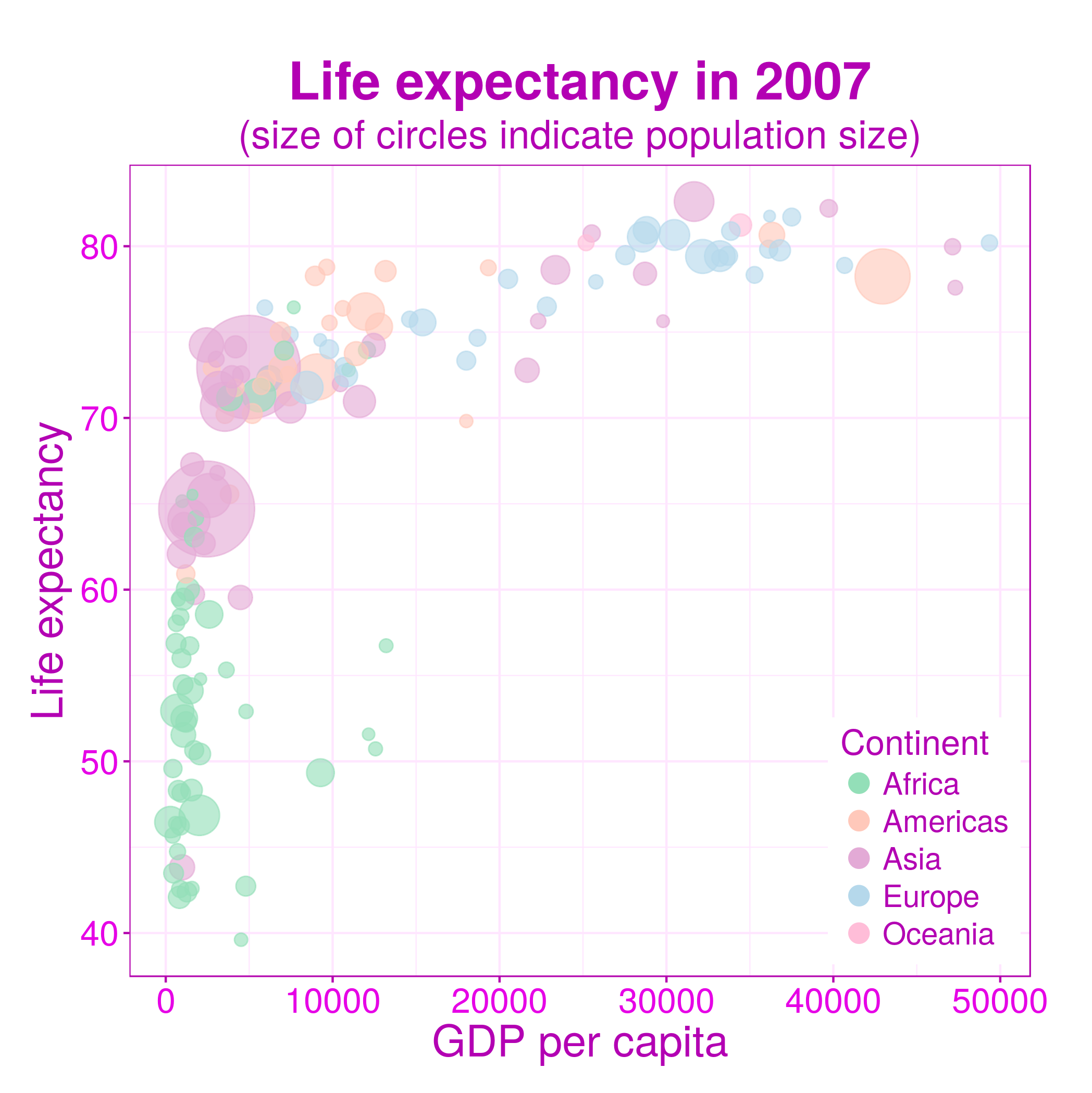
And now lets use our new theme to make an actual plot using the dataset from the gapminder package.
#Importing library with dataset
library(gapminder)

#Subset with data from year 2007
year.2007.df <- subset(gapminder, year == "2007")

#Making plot

#Making a plot with the data from 2007, with gdpPercap on the x-axis..
#..and lifeExp on the y-axis, and using colours to identify them by..
#..continent, and want the point size scaled according to pop
pink.plot <- ggplot(year.2007.df, aes(x=gdpPercap, y=lifeExp, colour=continent, size = pop)) +
#Telling R that that we want a scatterplot with semi-transparent points
geom_point(alpha = (5/8)) +
#Telling R to use the pink theme we just made
theme_pink +
#Changing the colours of the points into the colours saved in..
#..melting_puppies, and that I want the title of the points in legend..
#..to be Continent
scale_colour_manual(values=melting_puppies, name="Continent") +
#Scaling the size of the points so they fit within the range of..
#..2 to 22 and removing description of point size from legend
scale_size_continuous(range=c(2,22), guide = FALSE) +
#Changing the labels of the x- and y-axis
labs(x="GDP per capita", y="Life expectancy") +
#Even though you have made a theme you can still edit it:
#Here we are changing the plot margins..
#..and that we want to change the position of the legend so it fits..
#..lower right corner of the plot
theme(plot.margin = unit(c(1,1,0.5,0.5), "cm"), legend.position = c(1, 0), legend.justification = c(1.05, -0.05)) +
#Adding a title and a subtitle
ggtitle(label = "Life expectancy in 2007", subtitle = "(size of circles indicate population size)") +
#Increase the points size in the legend to 4, and making them opaque
guides(colour = guide_legend(override.aes = list(size=4, alpha = 1)))

#Looking at the plot
pink.plot

#Saving plot
ggsave("pink-lifeexp.png")
This is what your example plot now should look like:
Congratulation, you now know the basics of how to make your own ggplot2 themes!